Woosh Beauty
Improved e-commerce navigation & collections page
COMPANY
Woosh Beauty
ROLE
UX Designer & Strategy Consultant
Skills
UX Design, UX Research, Data Analytics
Team
CMO, Creative Director, 2 Developers






What is Woosh Beauty?
Woosh Beauty makes makeup effortless and inclusive with all-in-one kits for every skin tone.
View Website

Site Audit Takeaways
Site Audit Takeaways
Using Microsoft Clarity Heatmaps, Google Analytics Data, and Shopify Data, I was able to uncover the biggest issues users face in the process of purchasing a product.
Users are not interacting with product pages
Average 90% drop-off rate from Collections Pages (pages with groups of products) to Product Description Pages.
Each additional step prior to add to cart causes 50% drop off
With a 50% drop-off rate at each step from the collections page to the 'Add to Cart' button, our goal is to streamline the process.
Next Step
Redesign the collections page and navigation to maximize the number of users completing purchases.
View Site Audit
Problem Statement
How can we redesign the collections page and optimize navigation to minimize drop-off rates while boosting conversion rates?
Aligning the Design & Development Teams
Aligning the Design & Development Teams
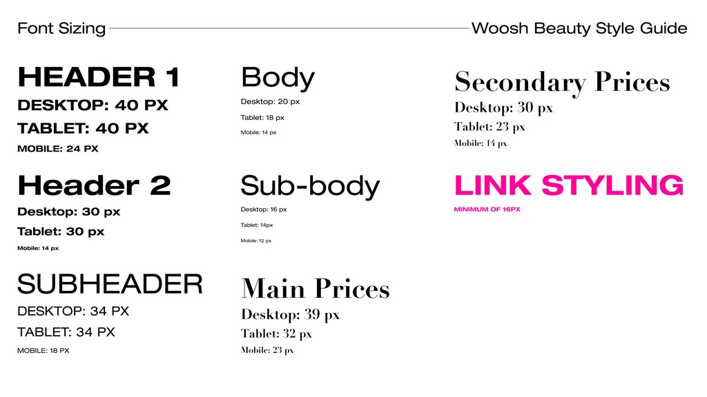
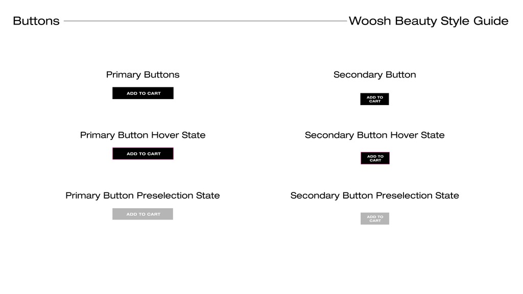
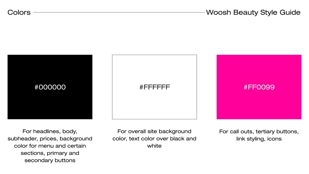
Throughout the website, a lack of standardized buttons, fonts, colors, and other design elements led to an inconsistent user experience due to the absence of a global CSS style guide.
Comprehensive Style Guide
Implemented a comprehensive style guide to govern the Global CSS for the Shopify 2.0 Upgrade, effectively addressing this issue and enhancing the site's overall visual consistency.
Accessibility of the Website
To better cater to Woosh Beauty's target demographic, primarily composed of women aged 40 and above, we made intentional adjustments. We increased font sizes and button dimensions, resulting in a more user-friendly interface that encouraged greater interactivity and improved readability.



Aligning on a Brand Message
Aligning on a Brand Message
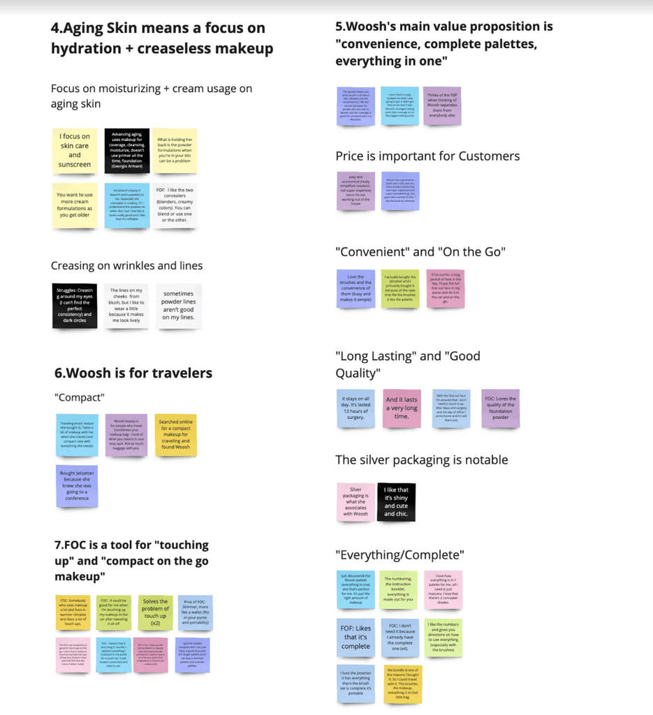
Woosh Beauty initially struggled with brand differentiation and a broad target market. By analyzing our website data, email campaign data and Focus Group data, we identified three key user interests. We then focused on these themes throughout the year and plan to integrate this new brand message into our collections pages.
Focus Group Data
Helped run focus group sessions with 12 participants to explore what Woosh Beauty customers value in their makeup products and brand.
View Focus Group Data

Branding
In Woosh Beauty's Shopify account, I helped design and develop landing pages utilizing HTML/CSS targeting these brand topics and developing content strategy to center these three topics.
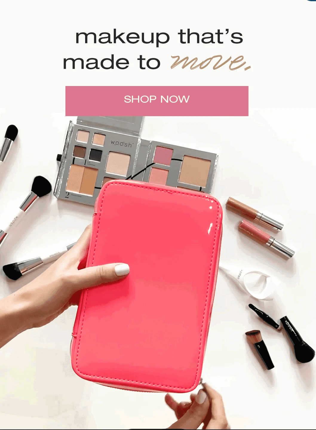
Travel Makeup
'Travel Makeup' is the keyword most associated with Woosh Beauty and is our top performing campaign. Highlighting our
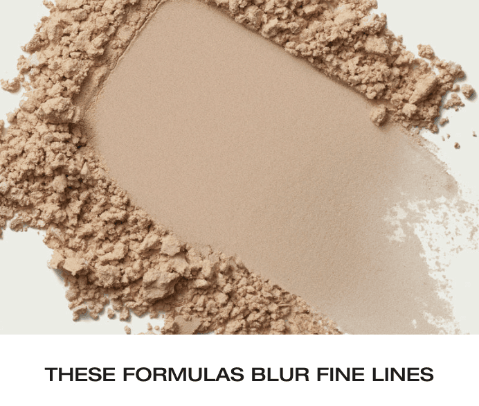
Mature Skin
Highlighting benefits for mature skin will help us connect with our 40+ audience.
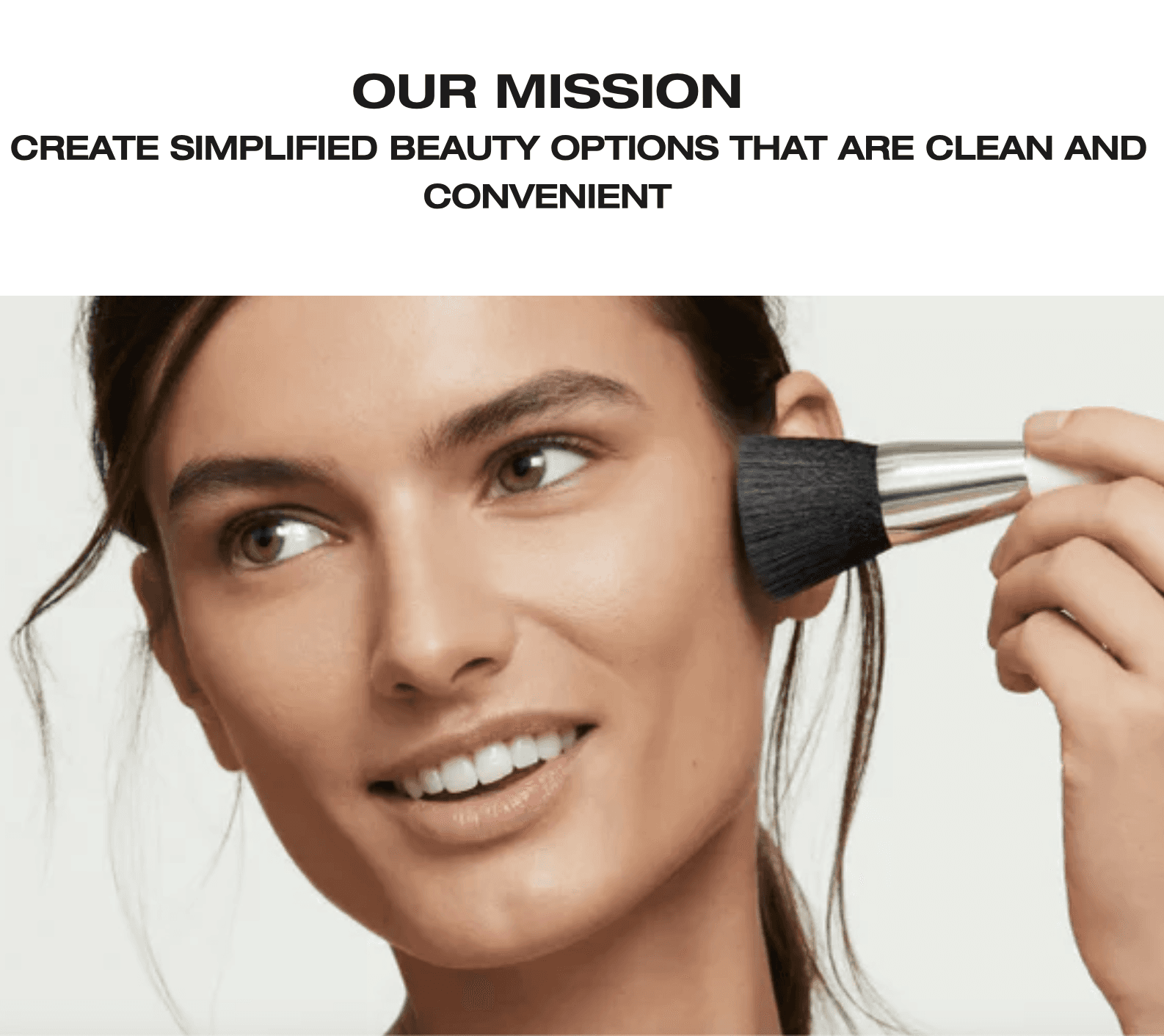
Clean Beauty
Connect your site to the most popular apps out there.
Final Delivery
UX Improvements
Woosh Beauty initially struggled with brand differentiation and a broad target market. By analyzing our website and email campaigns, we identified three key user interests. We then focused on these themes throughout the year and plan to integrate this new brand message into our collections pages.
Connecting blogs & resources
Blogs have high conversion rates, therefore, putting it in collections will boost SEO & conversions.


SEarch engine optimization
To boost SEO, we added out-links with keywords at the bottom of collections pages, hidden as a helpful tool to guide users.


Add to cart
Shade choices were available on collections pages, but without an 'Add to Cart' option. Adding it could boost conversion rates since users often browsed by shade.


Streamlined Navigation
Each click causes a 50% drop-off. Sub-navigation lets users view collections without the menu. We also added "sort by product type" for easier searches.


Concise hamburger menu
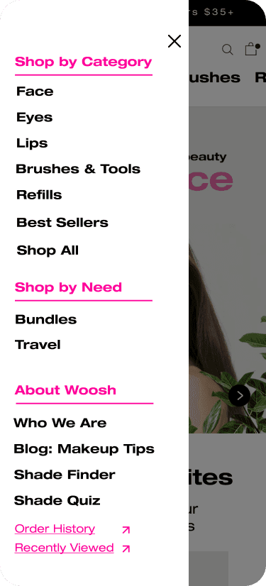
Analysis showed users only selected 13 of 30 menu categories, so we removed the two-click barrier to collections pages and unused category options.


Connecting blogs & resources
Blogs have high conversion rates, therefore, putting it in collections will boost SEO & conversions.


SEarch engine optimization
To boost SEO, we added out-links with keywords at the bottom of collections pages, hidden as a helpful tool to guide users.


Add to cart
Shade choices were available on collections pages, but without an 'Add to Cart' option. Adding it could boost conversion rates since users often browsed by shade.


Streamlined Navigation
Each click causes a 50% drop-off. Sub-navigation lets users view collections without the menu. We also added "sort by product type" for easier searches.


Concise hamburger menu
Analysis showed users only selected 13 of 30 menu categories, so we removed the two-click barrier to collections pages and unused category options.


Connecting blogs & resources
Blogs have high conversion rates, therefore, putting it in collections will boost SEO & conversions.


SEarch engine optimization
To boost SEO, we added out-links with keywords at the bottom of collections pages, hidden as a helpful tool to guide users.


Add to cart
Shade choices were available on collections pages, but without an 'Add to Cart' option. Adding it could boost conversion rates since users often browsed by shade.


Streamlined Navigation
Each click causes a 50% drop-off. Sub-navigation lets users view collections without the menu. We also added "sort by product type" for easier searches.


Concise hamburger menu
Analysis showed users only selected 13 of 30 menu categories, so we removed the two-click barrier to collections pages and unused category options.


Connecting blogs & resources
Blogs have high conversion rates, therefore, putting it in collections will boost SEO & conversions.


SEarch engine optimization
To boost SEO, we added out-links with keywords at the bottom of collections pages, hidden as a helpful tool to guide users.


Add to cart
Shade choices were available on collections pages, but without an 'Add to Cart' option. Adding it could boost conversion rates since users often browsed by shade.


Streamlined Navigation
Each click causes a 50% drop-off. Sub-navigation lets users view collections without the menu. We also added "sort by product type" for easier searches.


Concise hamburger menu
Analysis showed users only selected 13 of 30 menu categories, so we removed the two-click barrier to collections pages and unused category options.


Connecting blogs & resources
Blogs have high conversion rates, therefore, putting it in collections will boost SEO & conversions.


SEarch engine optimization
To boost SEO, we added out-links with keywords at the bottom of collections pages, hidden as a helpful tool to guide users.


Add to cart
Shade choices were available on collections pages, but without an 'Add to Cart' option. Adding it could boost conversion rates since users often browsed by shade.


Streamlined Navigation
Each click causes a 50% drop-off. Sub-navigation lets users view collections without the menu. We also added "sort by product type" for easier searches.


Concise hamburger menu
Analysis showed users only selected 13 of 30 menu categories, so we removed the two-click barrier to collections pages and unused category options.


Connecting blogs & resources
Blogs have high conversion rates, therefore, putting it in collections will boost SEO & conversions.


SEarch engine optimization
To boost SEO, we added out-links with keywords at the bottom of collections pages, hidden as a helpful tool to guide users.


Add to cart
Shade choices were available on collections pages, but without an 'Add to Cart' option. Adding it could boost conversion rates since users often browsed by shade.


Streamlined Navigation
Each click causes a 50% drop-off. Sub-navigation lets users view collections without the menu. We also added "sort by product type" for easier searches.


Concise hamburger menu
Analysis showed users only selected 13 of 30 menu categories, so we removed the two-click barrier to collections pages and unused category options.


Connecting blogs & resources
Blogs have high conversion rates, therefore, putting it in collections will boost SEO & conversions.


SEarch engine optimization
To boost SEO, we added out-links with keywords at the bottom of collections pages, hidden as a helpful tool to guide users.


Add to cart
Shade choices were available on collections pages, but without an 'Add to Cart' option. Adding it could boost conversion rates since users often browsed by shade.


Streamlined Navigation
Each click causes a 50% drop-off. Sub-navigation lets users view collections without the menu. We also added "sort by product type" for easier searches.


Concise hamburger menu
Analysis showed users only selected 13 of 30 menu categories, so we removed the two-click barrier to collections pages and unused category options.


Connecting blogs & resources
Blogs have high conversion rates, therefore, putting it in collections will boost SEO & conversions.


SEarch engine optimization
To boost SEO, we added out-links with keywords at the bottom of collections pages, hidden as a helpful tool to guide users.


Add to cart
Shade choices were available on collections pages, but without an 'Add to Cart' option. Adding it could boost conversion rates since users often browsed by shade.


Streamlined Navigation
Each click causes a 50% drop-off. Sub-navigation lets users view collections without the menu. We also added "sort by product type" for easier searches.


Concise hamburger menu
Analysis showed users only selected 13 of 30 menu categories, so we removed the two-click barrier to collections pages and unused category options.


The Data-Driven Decision
I leveraged Microsoft Clarity Heatmaps in conjunction with Google Analytics Behavior Flows to meticulously analyze user interactions to guide design decisions.
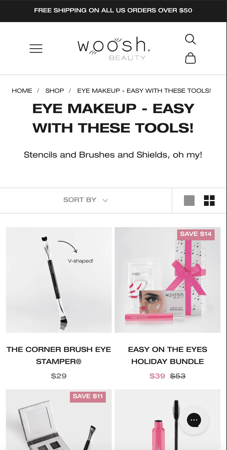
Each extra click causes a 50% drop-off. How can we improve navigation to reduce clicks?
A streamlined navigation bar is crucial to decrease number of clicks.
Users can now sort collections pages by product type.
76% of users view product shades on the collections page, highlighting the need for direct shade selection and add-to-cart options.
68% of users click on "sort by" but quickly exit the dropdown, indicating a need for more filtering options.
Reviews boosts conversion rates by 32%. Therefore, we should include them on collections pages.
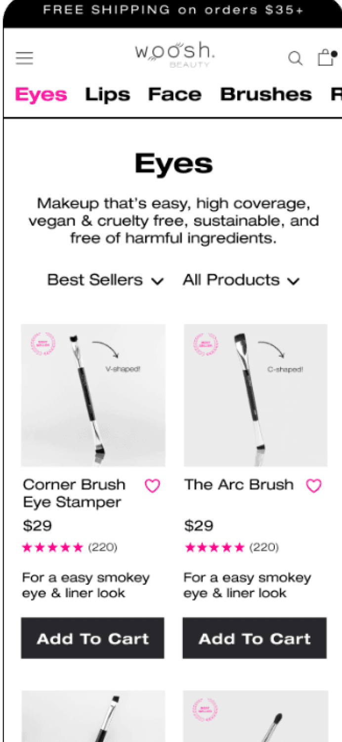
It currently takes two clicks to reach a collections page with 30 categories, but users select only 13.
Reduced categories from 30 to 13 and increased text size for better accessibility for our 40+ audience.
Each extra click causes a 50% drop in engagement, with an average of 2 clicks to reach a collections page. Reducing clicks by 1 will shorten the time to the collections page.
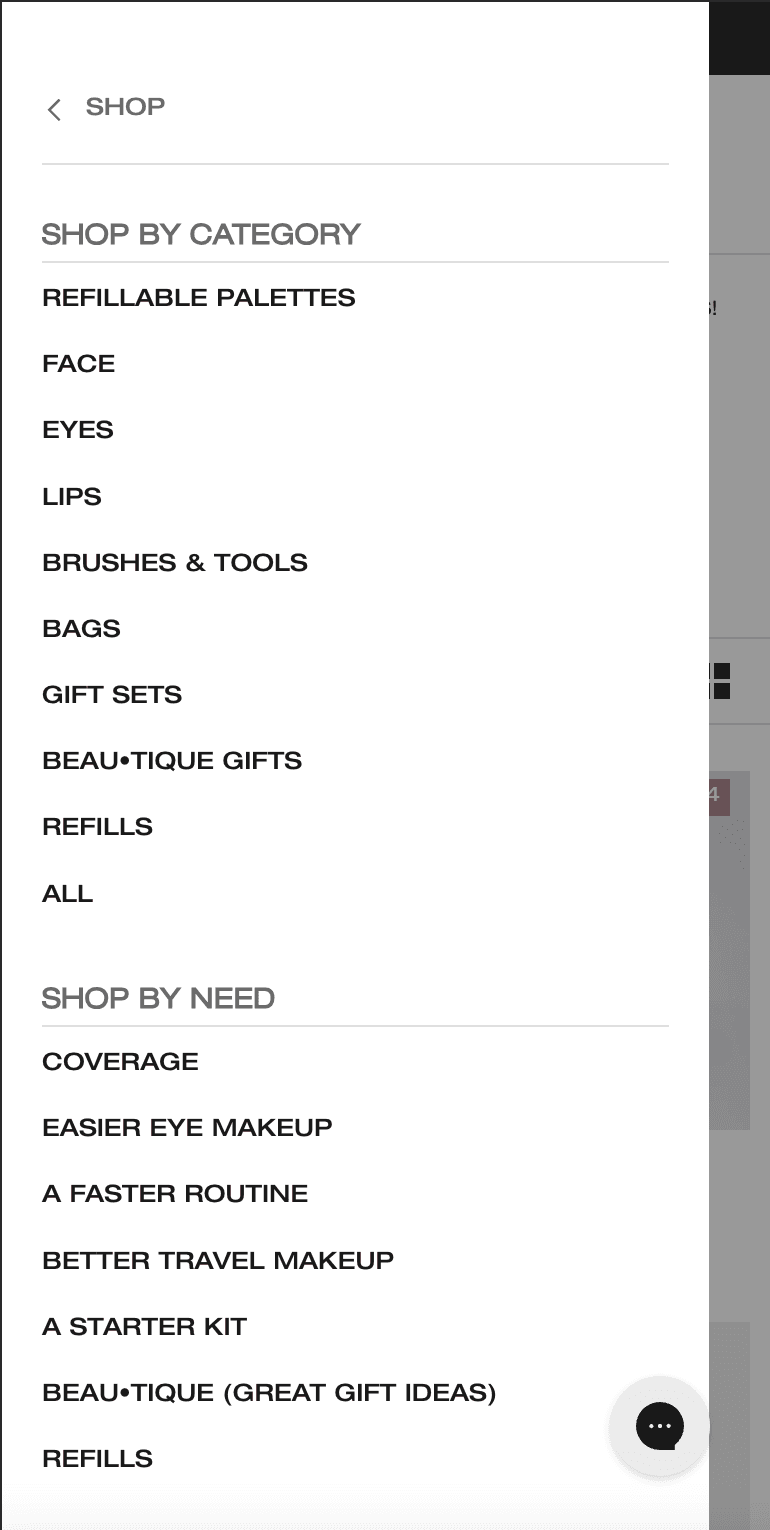

Final Delivery
A new collections page with streamlined navigation and filtering, direct purchase options, and enhanced SEO.
The Final Delivery
A new collections page with streamlined navigation and filtering, direct purchase options, and enhanced SEO.
Key Takeaways & Next Steps
The design addresses key findings from user testing and data analysis by:
Collaboration with the Creative & Development Team
Due to ongoing mistranslations between the Creative and Development teams, designs weren't being seamlessly implemented on the site. By creating a style guide and establishing a Global CSS guide, we ensured consistent design implementation across the site.
Utilization of Data Analytics to Inform Design
Leveraging heatmaps from Microsoft Clarity and Google Analytics behavior flows, we strategically prioritized projects that promised the highest ROI with minimal effort.
Further Tests Needed
Through this redesign, we expect a reduced drop-off rate from the collections page, higher click rates on product pages, and increased traffic to the blog and resources sections. However, additional testing is required to validate the redesign’s impact and identify further optimization opportunities.
Case studies
Case studies
Case studies